Full-Stack
Developer
UX/UI Designer
MY PROJECTS
LATEST REALEASE
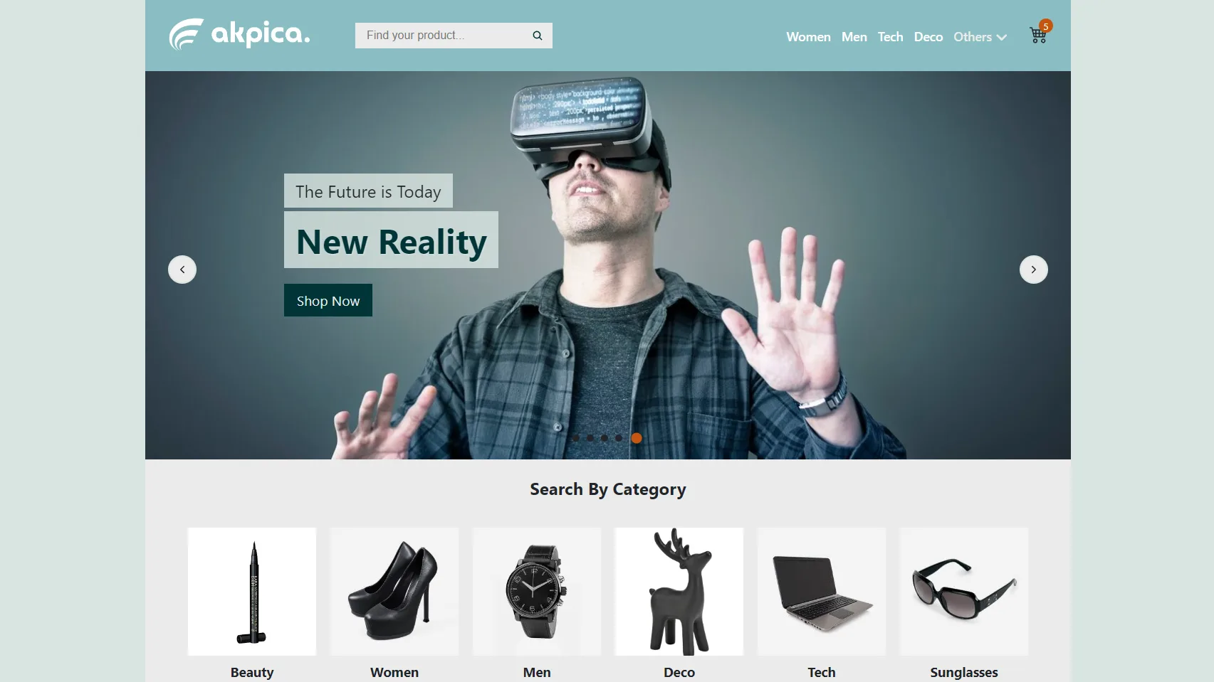
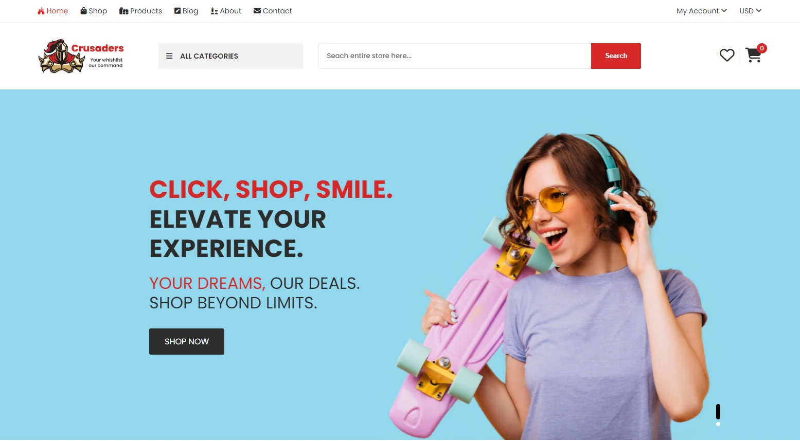
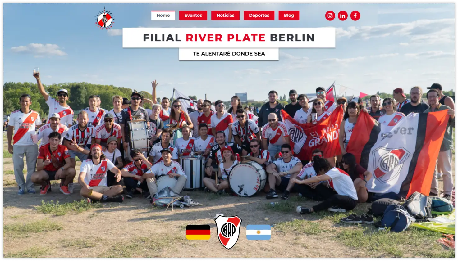
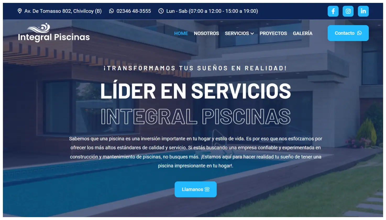
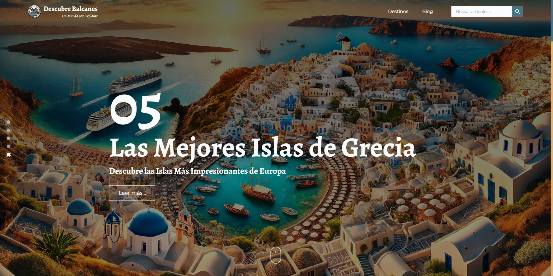
JavaScript
The Projects JS
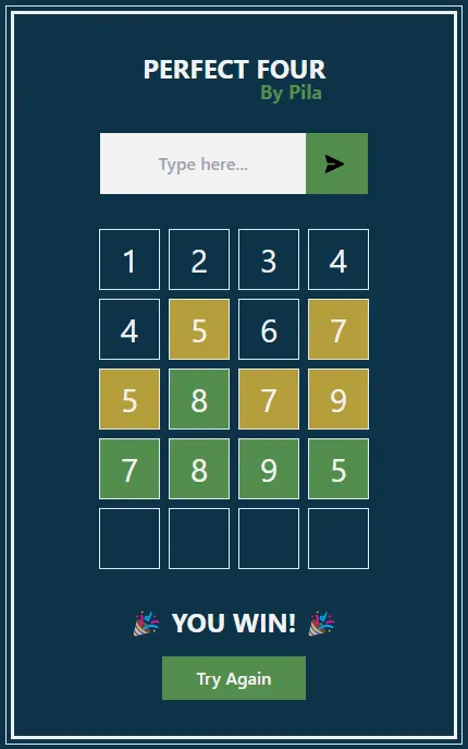
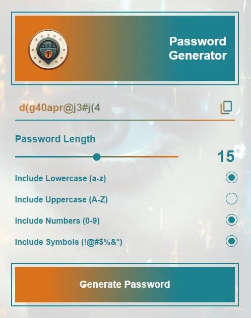
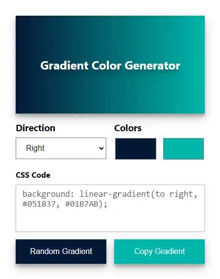
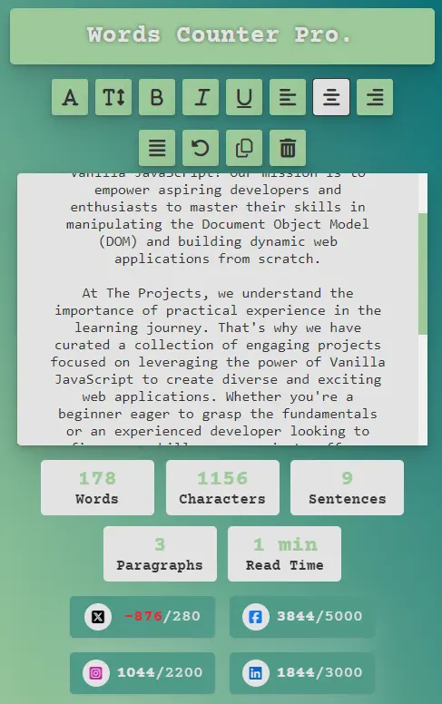
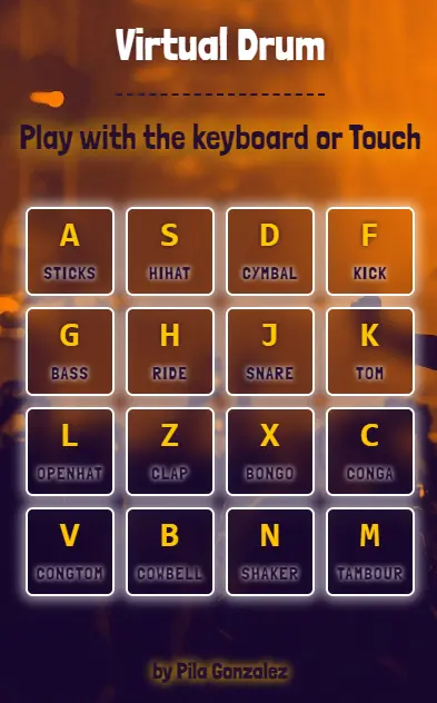
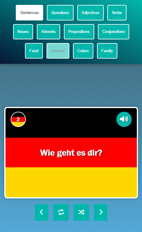
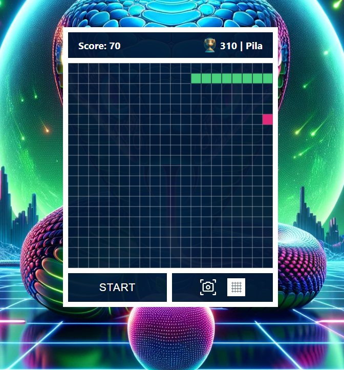
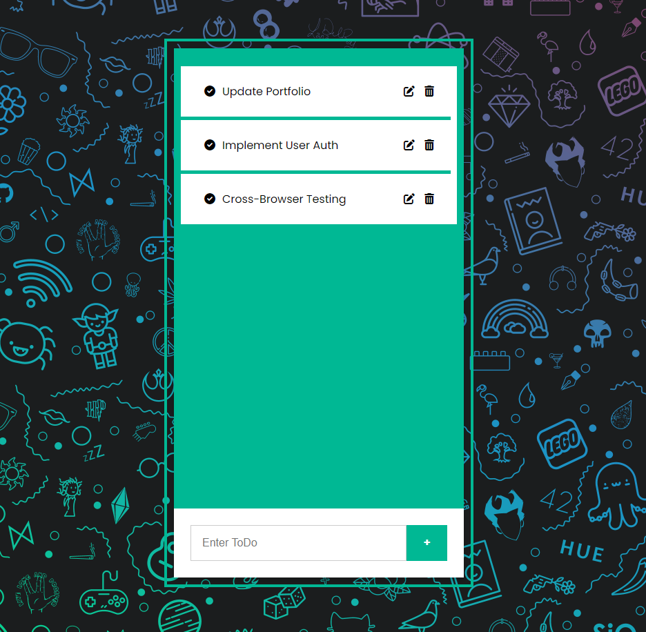
JavaScript Projects for mastering the art of web development through hands-on practice with Vanilla JavaScript!
React/Vite
Clean Template
This template provides a minimal setup to get React working in Vite, completely clean, without any extra noise.
Next.js
Pizza/restaurant
Responisve restaurant website using the powerful combination of React, Next.js, TypeScript, and Tailwind CSS.
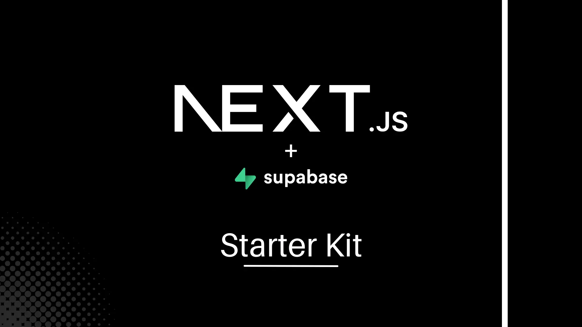
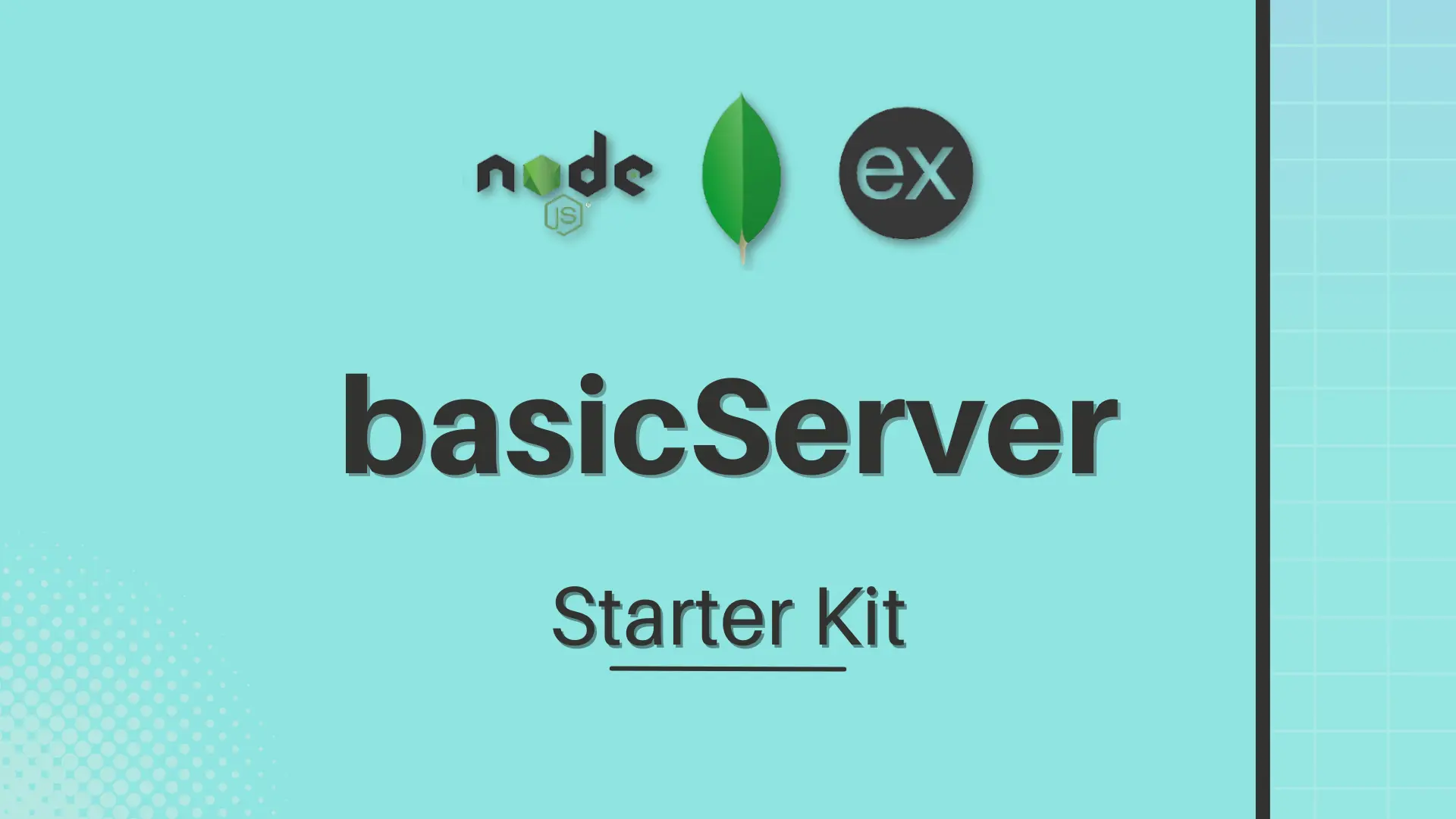
STARTER KITS
💻 These are a serie of Starter Kits that I created to save fellow developers the hassle of configuration and setup, allowing them to dive straight into what them love most: coding!
With this starting kits, developers can focus more on bringing their ideas to life and less on the intricacies of setting up your projects from scratch 💻
About
50 WORDS (OR LESS)
I am a versatile Frontend UX/UI Developer with a creative flair. My passion lies in crafting impactful websites, blending design aesthetics with a digital mindset that help brands make an impact and get the Next Level through immersive user experiences.
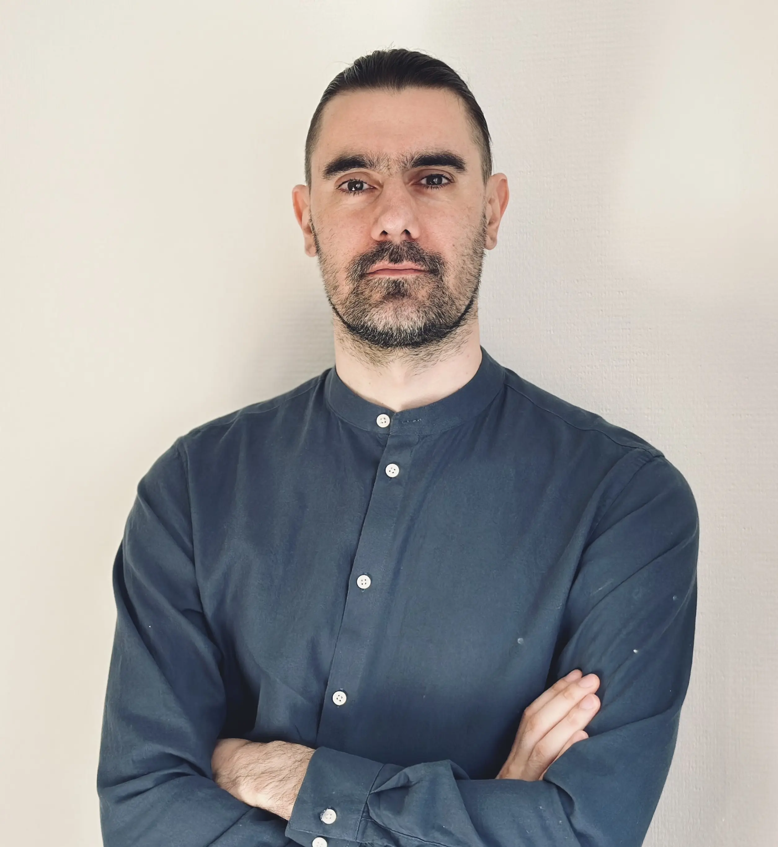
Hi, I'm Ezequiel "Pila" Gonzalez, a professional Frontend UX/UI Developer based in Berlin, with +10 years of experience.
After working as a consultant for entrepreneurs, I decided that it was time to make a major change in my life and I went on a trip around the world. I visited more than 45 countries on 5 continents. I have lived and worked, mainly in the tourism sector, in Spain, Croatia, Japan, New Zealand, Montenegro, Albania, Morocco, Argentina and now in Germany.
For more than 10 years I have been dedicated to Web Development, Content Creation, and Digital Marketing, with a focus on copywriting, design trends, and SEO.
With a track record of creating over 100 websites and successfully completing various web development projects, I've authored 300+ articles and published 3 books in Spanish. Now, I reside in Berlin with my wife and my daughter, and am eager to bring my wealth of experience to assist you with your Web Development and Design projects.
Feel free to reach out. I look forward to connecting. See you on the other side.
BERLIN, DE
Case Study
Inspiration
For a while, I had been intrigued by the New Brutalism design trend and decided to take on the challenge of creating my own website in this style. After studying various designs within this trend, I opted to follow the New Brutalism with a mix of Memphis style, but with a slightly muted color palette. The vibrant colors initially associated with the trend were too intense for my taste.
Design
I began the design process in Figma, drawing inspiration from the community and utilizing resources available there. I create the color palette and choose the typography, and then I started to design the components. I used the Auto Layout feature to create the responsive design. Finaly, I created a prototype to test the user experience and I downloaded the drawings in SVG format to use them in the development phase.
Development
Now it was the time to create the the website. I used React with Vite as a library/framework. CSS Grid in combination with Flexbox to create the layout. I also created some CSS variables to manage the colors, fonts, border, shadows and paddings. I also used the Lighthouse tool to optimize the website for performance and SEO. Finally, I deployed the website first in GitHub and then I linked it to Netlify.
What I achieved
- Hover Effects: I've mastered hover effects by using the ~ selector to apply dynamic changes to various elements when hovering over a specific one. This is evident in the top navigation bar where hovering over 'About' moves an arrow above it. Similarly, in 'My Curriculum' and 'My Projects' buttons, the middle arrows change direction on hover. I strategically ordered elements using the order property, allowing the last HTML element, the arrow, to appear in the middle of the buttons..
- Spotify-Style Cards: Creating the Spotify-style cards proved to be the most substantial challenge. While designing, I underestimated the complexity of implementing them. Thanks to the flexibility of display: flex, I managed to develop a design that closely resembled the original in Figma. However, this required nesting numerous div elements and dealing with complex class naming (class='the-div-of-the-div-of-the-div'). To achieve that, I simplified the approach and isolated each card into its own components.
- Positioning: I delved into the extensive use of position: absolute, aiming to constrain elements within their parent containers to achieve precise layouts. This approach taught me the importance of not allowing parent elements to become overly broad.
- Flex-Wrap: This CSS property facilitates responsive design effortlessly by allowing flex items to wrap onto multiple lines. Its implementation eliminates the necessity for additional media queries, streamlining the development process.
- Extra details:
Open Graph Cards: I added Open Graph cards for improved social sharing.
Cursor Styles: I customized the cursor styles for various decorative elements on the website.
Scrollbar and Text Selection: I adjusted the scrollbar and text selection styles to align with the overall design.
